top of page
ConnectWise Resource Center Email Comp
March 2020
PROGRAMS USED:
Adobe Illustrator
MY ROLE:
Senior Graphic Designer
MY CLIENT:
ConnectWise, LLC
B2B software company
CHALLENGE:
Create an engaging email design based on best practices for resource emails that can be used to A/B test against the current resource email design.
SOLUTION:
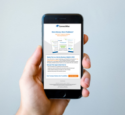
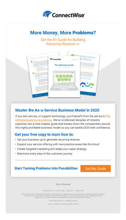
The original email Design used bold blocky color that chopped up the email into several parts. It got the message across, but it was not pretty. This design uses all the same text and imagery elements that allow the viewer to see live text for the heading and body, and an image of what book they are getting, but the color blocking is less distracting and designed to guide the eye instead of break up the header from the body with a straight line like before.
 |  |
|---|
bottom of page